News
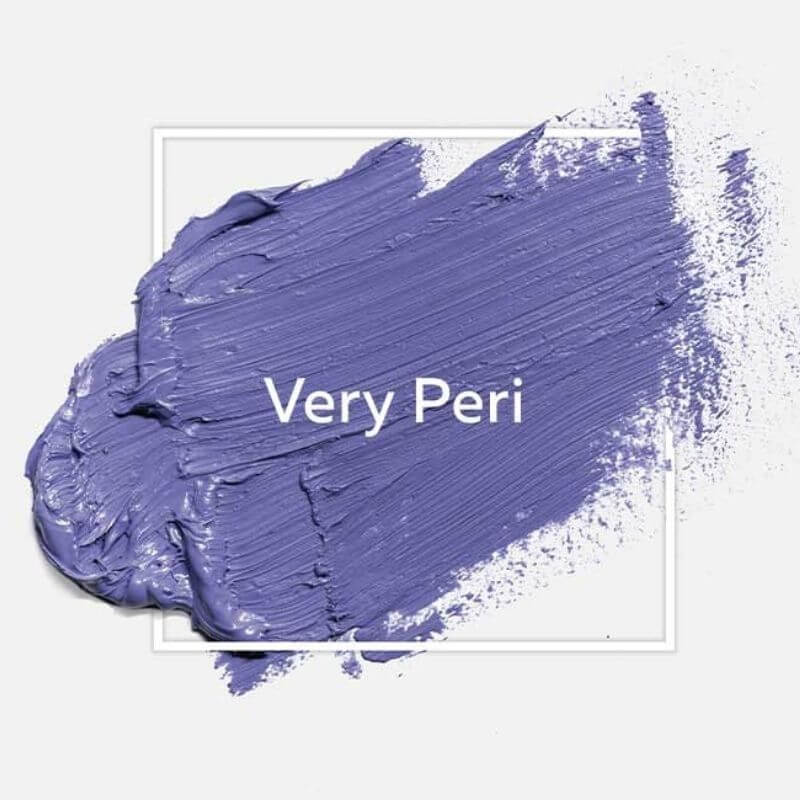
2022 Pantone color: Very Peri Purple
The choice of Pantone 2022 color
Like every year, the American Pantone Foundation reveals a star color synthesizing current artistic trends. Pantone 2022 is nothing other than PANTONE 17-3938 Very Peri: A light shade of blue, interspersed with a subtle dose of purplish red. This shade is chosen by color professionals, applied to the fields of arts and design, the latter is chosen through a long process of monitoring and reflection. The Pantone color 2022 is chosen according to a detailed analysis of the trends which strike the various fields of creation: fashion, graphics, design, painting, cinema, etc...In this regard, the latter doesn’t stick tosubjective considerations related to arbitrary artistic choices, but intends to reveal the modern evolution of our morals and social issues.
The Pantone color as a symbolic
mark of contemporary changes
When it comes to the language of colors, purple has always had a unique meaning: it symbolizes intellectualism but culture too. This explains its relatively timid use in the world of graphic design. However, this shade also displays a slightly assertive shade of blue. In the West, while purple is related to culture, blue is translated as infinity, wisdom, and the future.
In this regard, the Pantone 2022 color is intended to be a subtle symbol of the state of mind marking the beginning of the year.
According to the American foundation, the Very Pery would express a lively and cheerful attitude (...) that encourages
courageous creativity and imaginative expression. This mentality would result through the evolution of our relationship with life and technologies. The post-Covid era seems to finally inspire new hope, not to mention, mature reflection in the use of science and digital tools.
Discover our new pantone 2022 colour collection, need some advice?
You can make a free 15-minute video conference appointment with an art curator.
You can make a free 15-minute video conference appointment with an art curator.
Very Peri: blue or purple?
While many of us refer to Very Peri as “purple,” it turns out that its nature is slightly more complex.
The American foundation does qualify its color of the year as blue. So, blue or purple? If it does seem that Very Peri is a kind of artificial purple, it could also be interpreted as a contemporary reinterpretation of the values which are closely related to our perception of blue.
THE VERY PERI COLLECTION BY CARRÉ D'ARTISTES
Seduced by the Pantone colour of the year? You can discover a multitude of contemporary artists using Very Peri in the Carré d'artistes section dedicated to this definitely modern colour.
A blue in disguise
If this is the Pantone color of the year, then Very Peri is a regular feature of many works of art and design. What makes this shade unique is that it often turns out to be used as a variation of purple, effectively combining with the chromatic harmonies relating to this color. Therefore, in painting, it will often be added with secondary shades such as bronze, straw yellow, or even fuchsia pink.
Therefore, even if it is theoretically a blue, we see that in the reality of the facts, Very Peri turns out to be used like a purple that we could qualify - not without being bold - as “fake blue”.”. It is also interesting to analyze the annual choice of Pantone as a re-questioning of current color affinities, obviously through reviewing the values expressed by contemporary artists.
The latter sprinkle with sparkling nuances, a color which is traditionally associated with wisdom and purity, translating a desire for creative emancipation and day dreaming, within the artworks displaying this color as ambiguous and intense.
The successor to the Pantone ultraviolet
If the choice of Very Peri is not trivial, it is also because it succeeds another purplish shade, elected by the foundation as the color of the year 2018: Ultra-violet. In this era before the major health pandemic, this choice of color reflected our society’s love for progress and the unprecedented power of imagination that the technological advances of the time gave us a glimpse of: In Vitro meat, 3D printing, etc. ... It is interesting to reflect in retrospect on this choice and how it is questioned today.
While science then seemed associated with a potential for exploration and freedom, almost comparable to the immensity of the cosmos, the latter now arouses more moderation and mistrust, which is reflected within the artistic enthusiasm around from Very Peri, today.
From imagination to hope
In 2022, the Pantone color reflects a questioning of our archetypal vision of science, but also a reversal of our ideological values. While it would be easy to claim that the current population is increasingly reluctant and disapproving of our technological adventures, the Pantone choice turns out to be more optimistic than that. Even though the Covid19 has triggered a lot of doubts about our vision of current technological woes, it seems that we have now gained in wisdom, allowing us to approach the technological changes of today with much
more parsimony. As the metaverse, crypto-currencies and uberization slowly take a grip on our daily lives, it is with great hope and moderation that artists come to paint a world that wants to be more mature and responsible. In other words, Very Peri is now positioned as a real shade of optimism, brightening everyone's mentality.
more parsimony. As the metaverse, crypto-currencies and uberization slowly take a grip on our daily lives, it is with great hope and moderation that artists come to paint a world that wants to be more mature and responsible. In other words, Very Peri is now positioned as a real shade of optimism, brightening everyone's mentality.
3 artists to discover using Very Peri purple
As the shade of the year is in the spotlight of design and fashion, we encourage you to discover modern artists taking over this complex color, resulting in extremely subtle artworks and in keeping with the age of time.
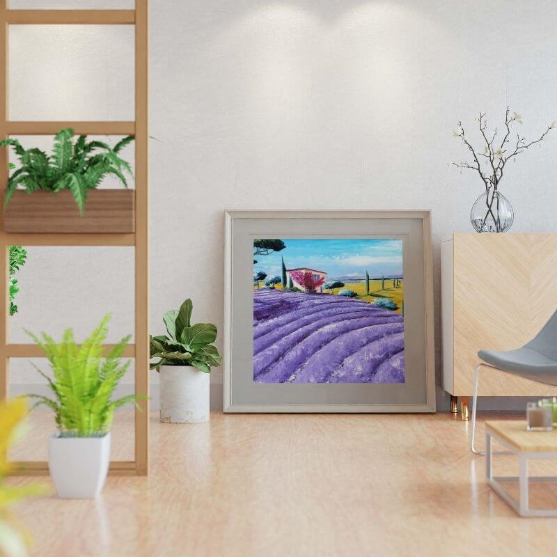
Corbière Liisa: Contemporary reviewal of landscape painting
Originally from Finland, the artist Liisa Corbière first stood out through her experience as a weaver, before devoting herself to painting. What makes her artwork so unique? A characteristic passion for landscape painting, distinguished by
very colorful paintings and an oil painting highlighting a surprising relief. Through the use of Very Peri, the latter comes to represent flower fields in the form of large, deep flat areas, triggering contemplation. If the shades of colors that are used modify our perception of reality, it is through the aim of describing a rich and colorful vision of the French countryside, which instantly brings,along an impression of calm and appeasement.
very colorful paintings and an oil painting highlighting a surprising relief. Through the use of Very Peri, the latter comes to represent flower fields in the form of large, deep flat areas, triggering contemplation. If the shades of colors that are used modify our perception of reality, it is through the aim of describing a rich and colorful vision of the French countryside, which instantly brings,along an impression of calm and appeasement.
1.jpg)
Espinoza Abril: Colorful and minimalist graphic compositions
A true follower of color, the Mexican artist Espinoza Abril stands out through his compositions which are abundant as they are colorful. The artist uses dark purple to highlight the various inhabitants of his painting, Espinoza naively describes vivid and musical scenes, subtly inspired by its Mexican culture.
He has a peculiar interest in animals, which emerge through a unique style, in a painting, where each element coexists in a peaceful manner.
He has a peculiar interest in animals, which emerge through a unique style, in a painting, where each element coexists in a peaceful manner.
Misako: An ode to contemporary pop culture
Emerged through the world of graffiti, the artist Misako uses modern techniques to describe a personal universe, which depicts the icons of pop culture. Posca markers, spray paint...The artist sets up brutal and colorful paintings, combining a set of references, giving rise to a unique mix of 21 st century must-haves: Campbell soup, Homer Simpson, San Gohan... Her works combine these televised figures with a universe of colors and intriguing letters.
Resolutely inspired by Andy Warhol, Misako describes a vision of pop culture through a surprisingly modern and flashy form.
Her use of Very Peri only remains richer and more fascinating.
Resolutely inspired by Andy Warhol, Misako describes a vision of pop culture through a surprisingly modern and flashy form.
Her use of Very Peri only remains richer and more fascinating.