News
Pantone Color 2022: A very happy purple!
Color at the disposal of creativity and imagination!
Every December, the Pantone Institute displays the trending color for the coming year.
Pantone is a sort of big boss of color, that determines which shade shall spruce up your future clothes, indoors and decorative tables.
For more than 23 years, the Pantone Color of the Year has brought momentum in many sectors such as fashion, design, not to mention, graphics and art.
Color experts travel the world to offer you colorimetric innovations and create atmospheres, closely related with world trends.
THE PANTONE COLOR INSTITUTE?
Pantone Color Institute is the business unit of Pantone that selects the Pantone Color of the Year and global color trends.
The latter also advises companies, while choosing their visual identity in order to establish their logos, packaging, advertising, graphics, etc.
They are experts in colorimetry, they determine which shade shall be the most suitable according to the company’s sector of activity.
A genuine benchmark for stylish desks, who wish to remain a leader in terms of trends.
The color chosen by the institute is rarely unanimous among the public, initially. The ready-to-wear and interior design industry will then be able to impose it by creating atmospheres that shall appeal to the less experienced ones in the field!
This is how everyone can treat it in their own way and enhance it; through their personal interpretation.
Discover our new pantone 2022 colour collection, need some advice?
You can make a free 15-minute video conference appointment with an art curator.
You can make a free 15-minute video conference appointment with an art curator.
Pantone color | Colors that speak to you
Pantone had made the choice of appeasement in 2020 with its "Classic Blue" whose aim was to be reassuring and to establish an atmosphere relying on confidence in a tense atmosphere.
For the year 2021, the Pantone of the year institute had selected two colors to illustrate our time.
These were PANTONE 17-5104 Ultimate Gray and PANTONE 13-0647 Illuminating, a combination of two diametrically opposed colors to express an image based on strength and durability, over time.
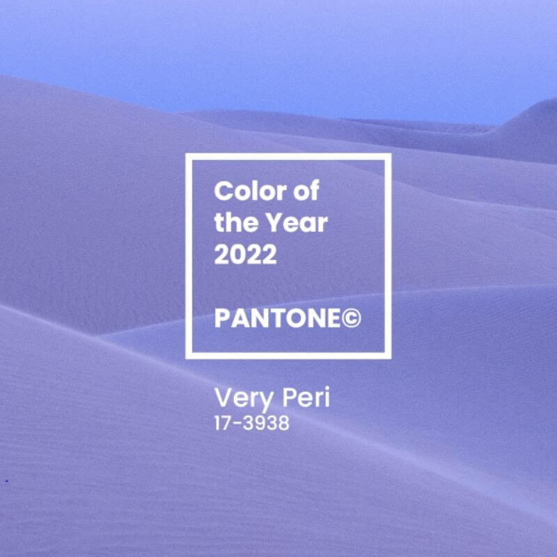
What if the Very Peri was a rapidly changing blue?
For this new year, it is a frank and unique choice represented by the Very Peri purple.
Some see it as blue and others see it as purple, it divides the public opinion in two, making us flexible. And that's what we do! The current news has forced us to adapt, by changing our way of thinking, to get familiarized with new technologies and opportunities that are within reach.
In fact, purple belongs to the family of blues, in which Pantone has added purple red to highlight that unique tone.
Very Peri | The choice of change
At the same time, reassuring, soft and dynamic, the Very Peri encourages us to enter the universe of the metaverse and the virtual world.
Our times are witnessing unprecedented changes and digital technology is taking more and more place in our respective lives.
Therefore, the Pantone Institute invites you to celebrate a new era, positioned under the sign of curiosity and creativity.
Through the trend of gaming, Pantone perfectly illustrates the creative world of graphics and opens the door to a virtual world, in which creativity has no limits. Symbol of lightness and optimism, it encourages us to indulge in art through all its forms, exploring our imaginative capacities.
Purple | Color of hope, color of history
A color full of mystery, recognized as "purple" only since the 18th century, when Isaac Newton identified it on the color spectrum.
It is a complex shade, tough to obtain, because it requires the right balance between cyan blue and magenta red, two hues which are diametrically opposed.
Still considered enigmatic, purple is a symbol of creativity and meditation.
"Ultra purple" or "Very Peri" | Ultra prized purple!
It is not a coincidence that it was the pantone 2018 color with a powerful and unconventional "Ultra-purple", which was then perceived as a message of hope for the coming months.
Therefore, its successor has its spot, Very Peri purple continues to fascinate and divide opinions, by being promising, bold and dynamic.
The complexity of this smart blue-red mixture demonstrates the changes taking place on our planet and the immensity of the opportunities which are within reach. Very Peri pushes back the field of possibilities, by encouraging everyone to renew himself, and think differently.
It encourages us to overcome the isolation we suffer from, by letting our artistic senses get the upper hand.
Integrate the Pantone color 2022 into your environment?
A super attractive color, Very Peri purple, is good at creating harmonious and cozy atmospheres. On the walls, it shall provide a relaxing atmosphere, provided it is used sparingly.
Its enthralling power can become rather intense, when it is too way too present in your interiors.
On the other hand, it can go well in a room which is dedicated to creation, in order to boost the imagination and trigger vitality.
For those who like the timeless style, it will be appropriate to implement it through touches, with subtlety and taste.
Therefore, you can imagine it as a thematic color of a table decoration, for your dishes or your household linen.
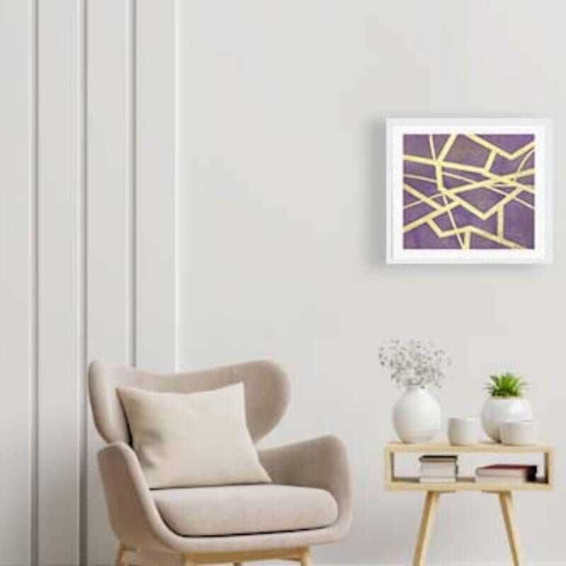
Very Peri in your artwork
Art and trend enthusiasts shall combine business with pleasure by offering themselves an SO pantone 2022 decorative work.
Carré d'artistes invites you to discover the Very Peri collection, on the 1st online sales network of contemporary art:
Carré d'artistes invites you to discover the Very Peri collection, on the 1st online sales network of contemporary art:
Our contemporary art gallery pays tribute to the Pantone Institute by celebrating its color, which was elected the color of the year in 2022, and encourages you to visit our universe, which is accessible to all.
Our goal is to open the highly codified universe of art galleries to the general public by offering them a warm and welcoming concept.
Five works that put Very Peri purple in the limelight:
The best summer in the valley | Vitoria
The contemporary work of art the most beautiful summer in the valley is a modern painting by the artist Vitoria. The Pantone color is highlighted here through the lavender fields.
NF 91 | Loussouarn Michele
A Figurative style watercolor. This painting is an artistic nude that plays with the natural shadows of the body, here painted in purple.
21.jpg)
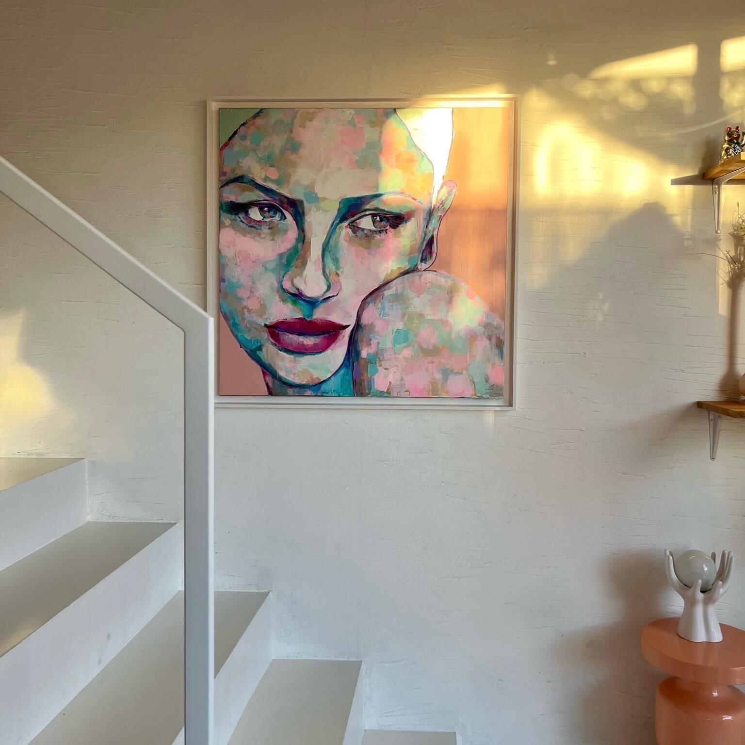
Iris | Vacaru Nicoleta
This figurative style artwork uses the new Pantone color to represent the face of a young woman.
Mister Monopoly | Schroeder Virginia
The artist used the mixed technique to create this painting and takes up the universe of Pop Art style highlighting the theme of Pop icons.
1.jpg)
Buzz Lightyear | Kedarone
This contemporary street artwork represents Buzz Lightyear, a famous character from the movie "Toy Story".
This contemporary street artwork represents Buzz Lightyear, a famous character from the movie "Toy Story".